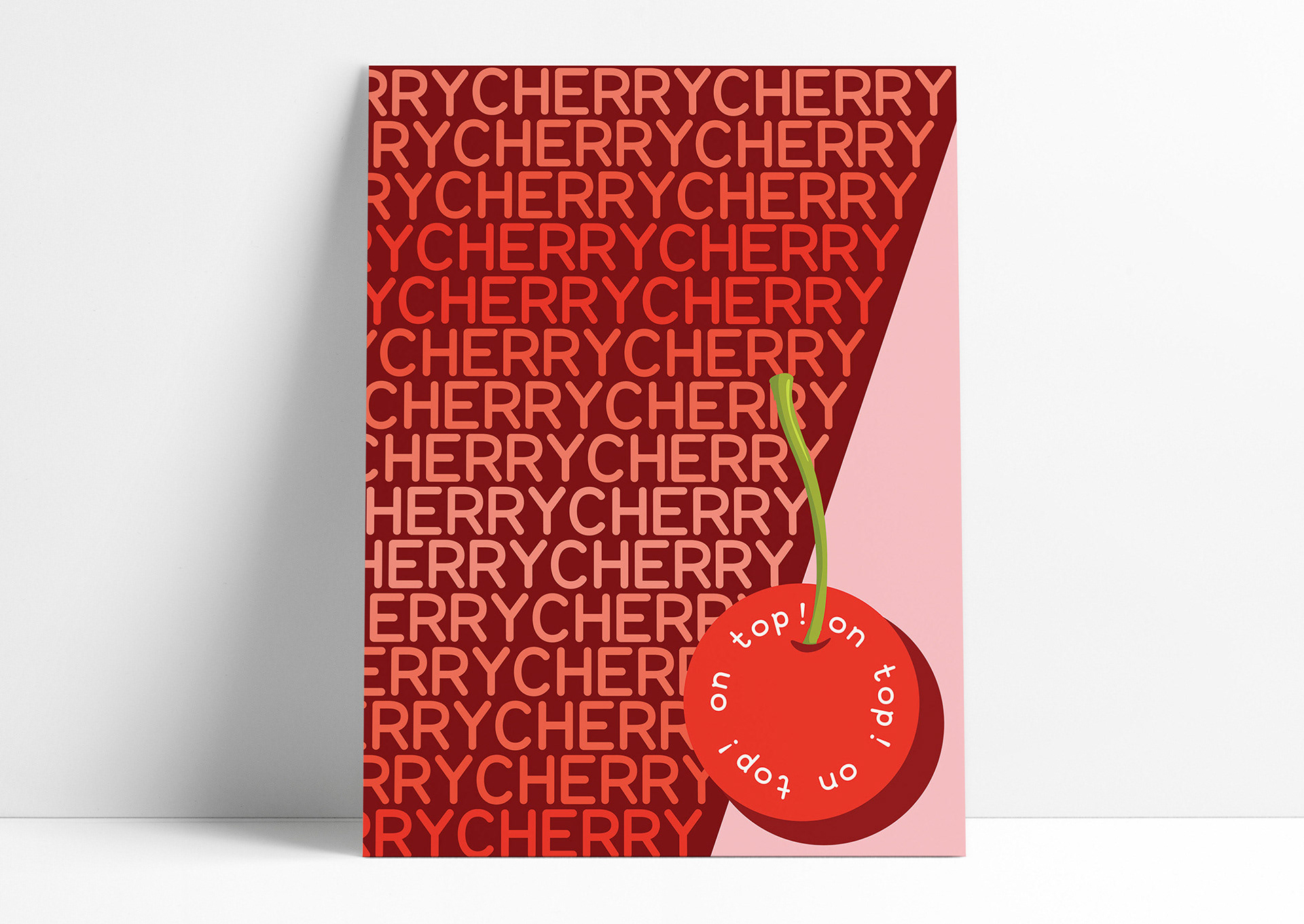
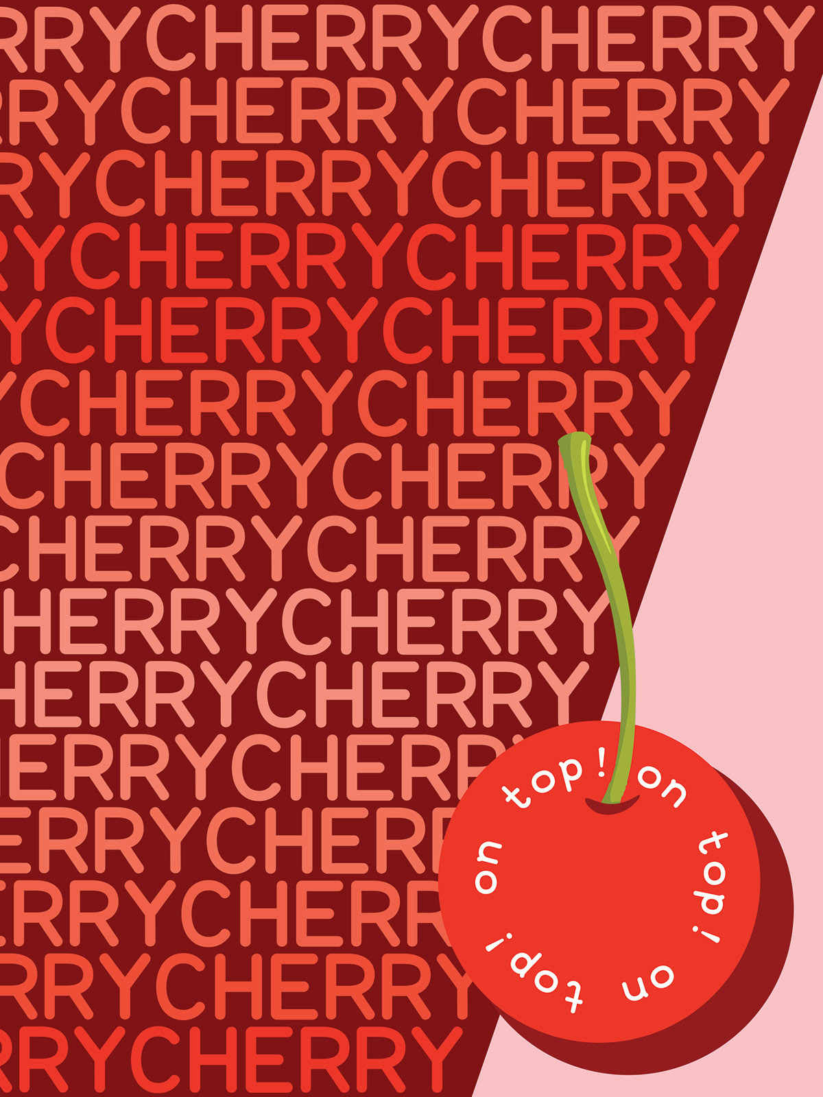

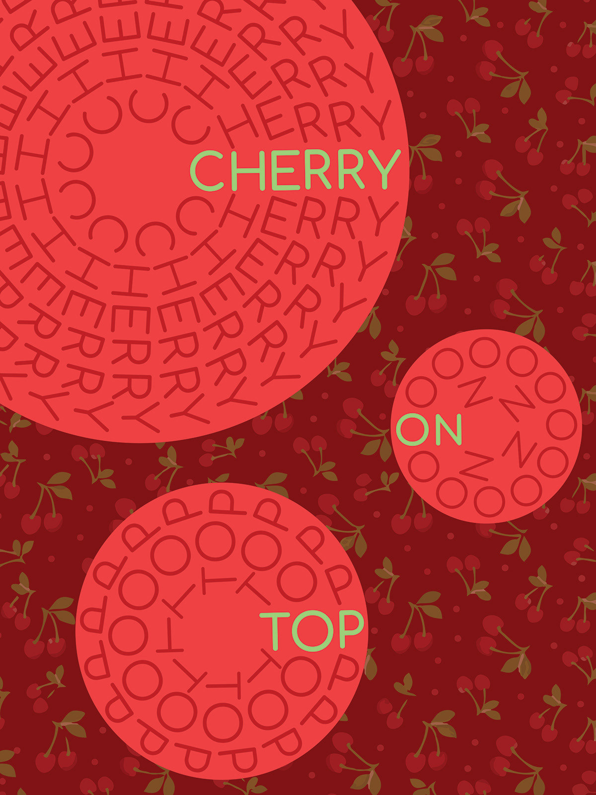
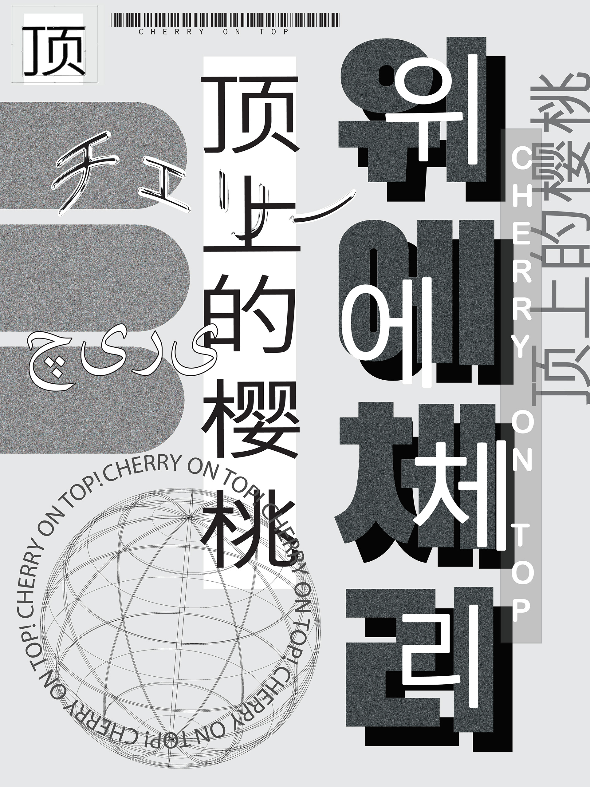
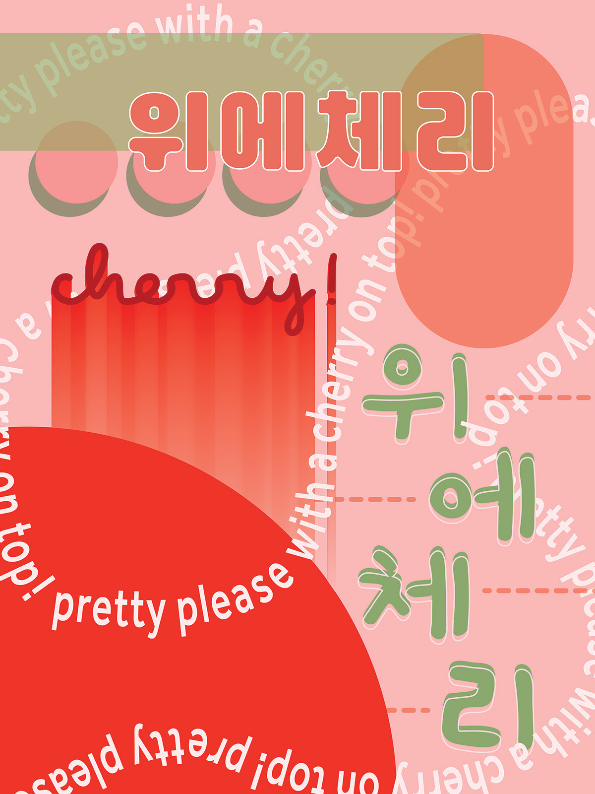

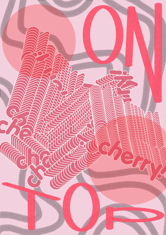
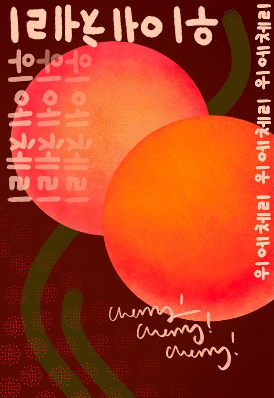


This project was assigned in my introductory graphic design course, Graphic Systems. The prompt was to choose a word or phrase and develop typographically focused poster designs. This is one of two sets I created. I wanted to explore and iterate on the shape, taste, pronunciation, color, actions, and life of cherries, both in the English language and through the visualization of the same phrase in Korean. I chose Korean because I’ve always been fascinated by the characters. I challenged myself by manipulating the legibility, x-height, baseline, and other aspects of each word in Korean.